Scaling Ecosystem Efficiency: Launching an AI platform on time with Ant Design

Role: Senior Product Designer | Team: 3 designers | Platform: Web | Client: AdTech Startup (2024–2026)

Web

Situation

An AdTech start-up was building an AI-powered marketing platform with several complex apps. It had just shifted its focus from small businesses to large companies, and a public launch at Cannes Lions was approaching.

Task

As Senior Product Designer in a team of three, I had to give the apps one consistent look and feel without slowing the engineers down.

Action

Building a system from scratch would have cost us time we didn't have. So we chose Ant Design, which matched the engineers' tools, and made it feel like our own product.

Building a timeline

  1. Prioritising what to change. Not every component needed attention, so I went through Ant Design's library and sorted components into four groups: use as they are, light customisation, rework or rebuild and new components. I prioritised by how often a component appears in the product and how much it affects the user's journey. This kept the effort on what mattered most and left the rest alone.
  2. Planning the team's work. I split the work between the three designers, so each person owned a clear area and we weren't duplicating effort.
  3. Timeline. I created a timeline that worked backwards from the Cannes Lions date, so we knew what had to be ready, and when, for developers to build it.

Token-Driven Architecture

The upfront cost was a full-day mapping session to trace how each primitive token cascaded into the semantic layer and into individual components. That foundation meant every subsequent change was made once, correctly.

colours-base-agency-500

Primitive token

#242A2D

Value

colour-agency-light-PrimaryBG

Semantic token (Purpose)

button-colour-PrimaryColour

Component token

Handling overrides sensibly

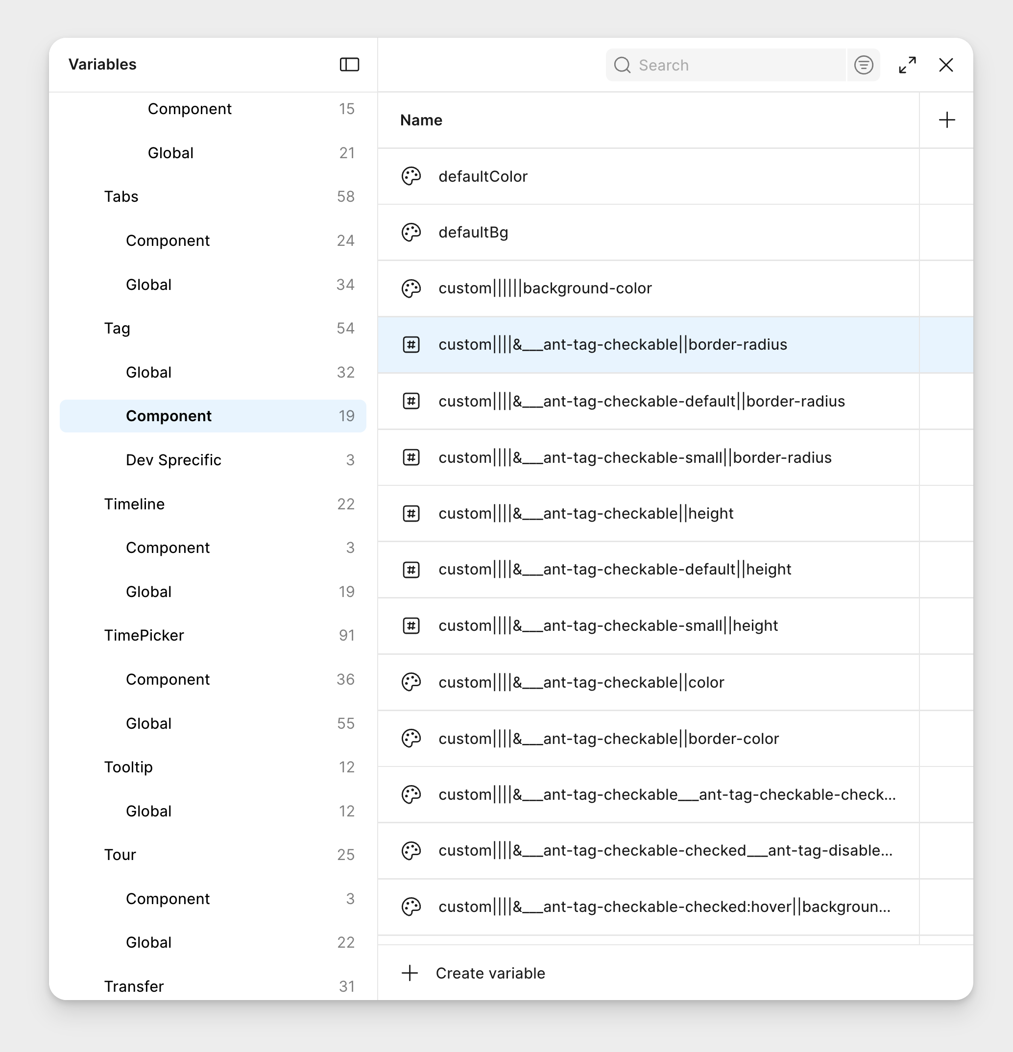
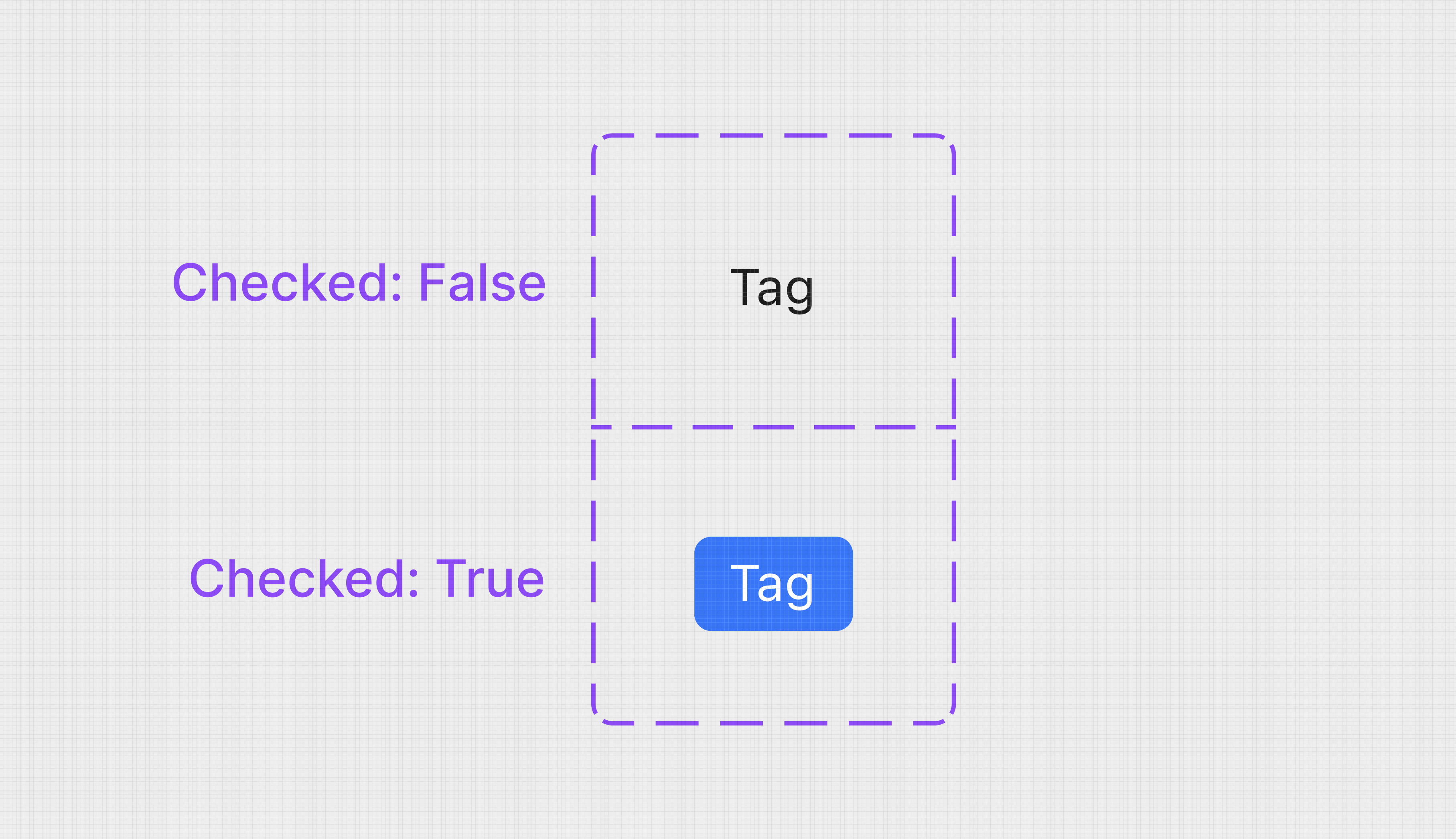
Some components needed heavy customising, such as custom checkable tags and certain button styles, and this created long chains of custom code that were hard to maintain.

I went back, labelled each custom setting, added a short description and separated them out, so the next person could understand and change them.
Before

After

Fixing accessibility gaps

Ant Design had several accessibility gaps (WCAG 2.2) out of the box mainly with colour contrast, I audited it manually and by providing screens to AI agents.

I defined a repeatable pattern for AI-assisted creative generation with three steps:

  • guide (check pre-filled information or result),
  • generate (create the result)
  • and process (show progress).

Designing the AI experience

  1. Guide

Auto-filled info

  1. Generate

Competitor

Input

Generate

  1. Process

Input Label

Generating...

Documentation as System UX

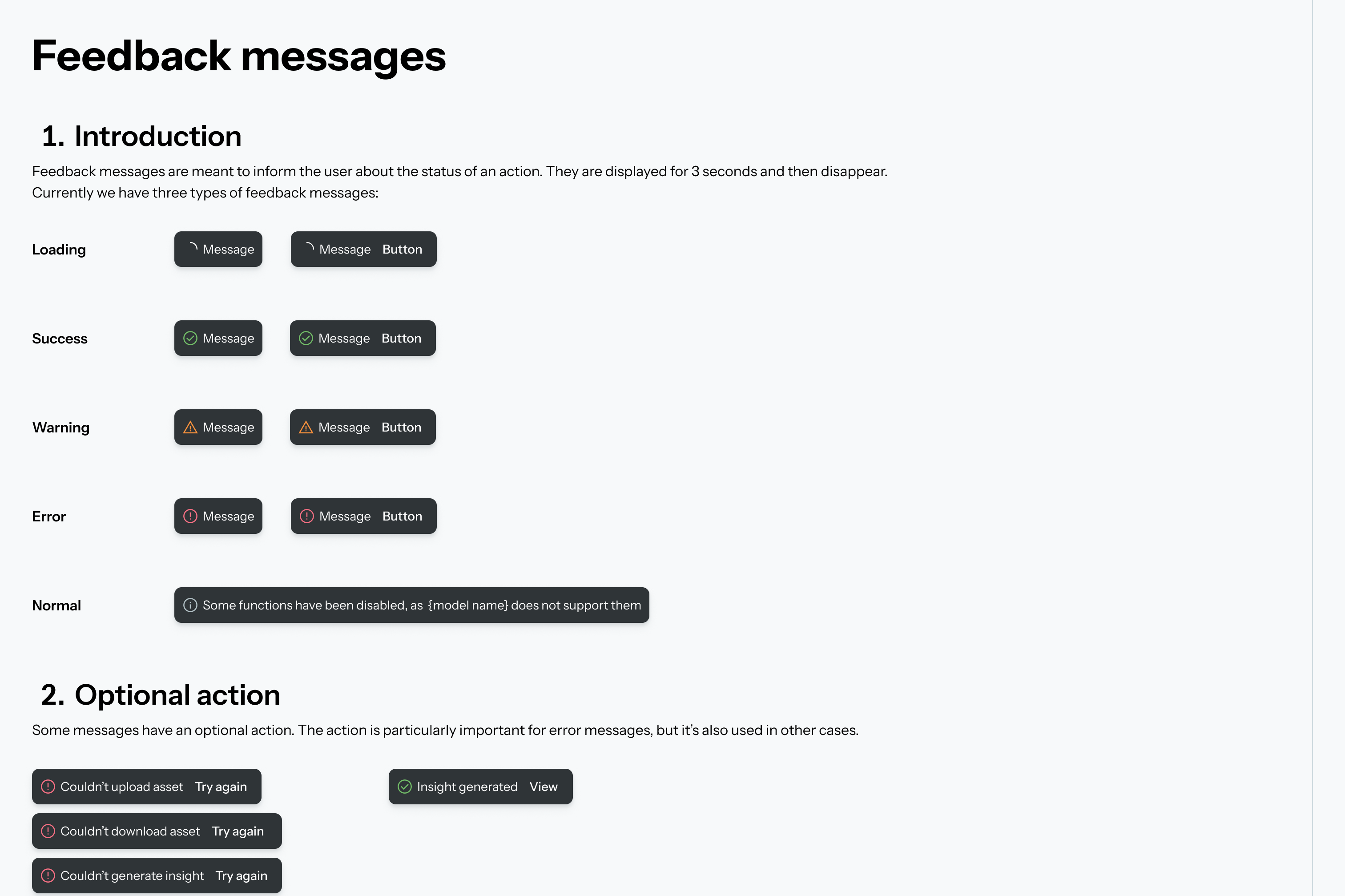
I wrote guidelines for tone of voice, common button names, components usage and page layouts, which stopped inconsistencies early in each project.

Handing over to developers

Result and impact

Public MVP delivered on schedule for Cannes Lions, directly supporting the closure of multiple multi-million-dollar deals. This was made possible by adopting Ant Design as the platform foundation, cutting six-plus months of build time.

Accelerated time-to-market: Adopting the framework saved an estimated 6+ months of build time compared to a proposed custom build.

Product Scalability: We successfully launched multiple complex sub-apps under a single, unified design language.

What I'd do differently

Avoid over-customising core components: I'd leave Ant Design's core components alone. Heavy custom changes became hard to maintain, so I'd now keep to a smaller set of changes.

File structure: Initially, we separated files by feature pods and kept ideation separate. We later merged explorations directly into primary feature files to improve cross-functional visibility.

Scaling Ecosystem Efficiency: Launching an AI platform on time with Ant Design

Role: Senior Product Designer | Team: 3 designers | Platform: Web | Client: AdTech Startup (2024–2026)

Web

Situation

An AdTech start-up was building an AI-powered marketing platform with several complex apps. It had just shifted its focus from small businesses to large companies, and a public launch at Cannes Lions was approaching.

Task

As Senior Product Designer in a team of three, I had to give the apps one consistent look and feel without slowing the engineers down.

Action

Building a system from scratch would have cost us time we didn't have. So we chose Ant Design, which matched the engineers' tools, and made it feel like our own product.

Building a timeline

  1. Prioritising what to change. Not every component needed attention, so I went through Ant Design's library and sorted components into four groups: use as they are, light customisation, rework or rebuild and new components. I prioritised by how often a component appears in the product and how much it affects the user's journey. This kept the effort on what mattered most and left the rest alone.
  2. Planning the team's work. I split the work between the three designers, so each person owned a clear area and we weren't duplicating effort.
  3. Timeline. I created a timeline that worked backwards from the Cannes Lions date, so we knew what had to be ready, and when, for developers to build it.

Token-Driven Architecture

The upfront cost was a full-day mapping session to trace how each primitive token cascaded into the semantic layer and into individual components. That foundation meant every subsequent change was made once, correctly.

colours-base-agency-500

Primitive token

#242A2D

Value

colour-agency-light-PrimaryBG

Semantic token (Purpose)

button-colour-PrimaryColour

Component token

Handling overrides sensibly

Some components needed heavy customising, such as custom checkable tags and certain button styles, and this created long chains of custom code that were hard to maintain.

I went back, labelled each custom setting, added a short description and separated them out, so the next person could understand and change them.

Before
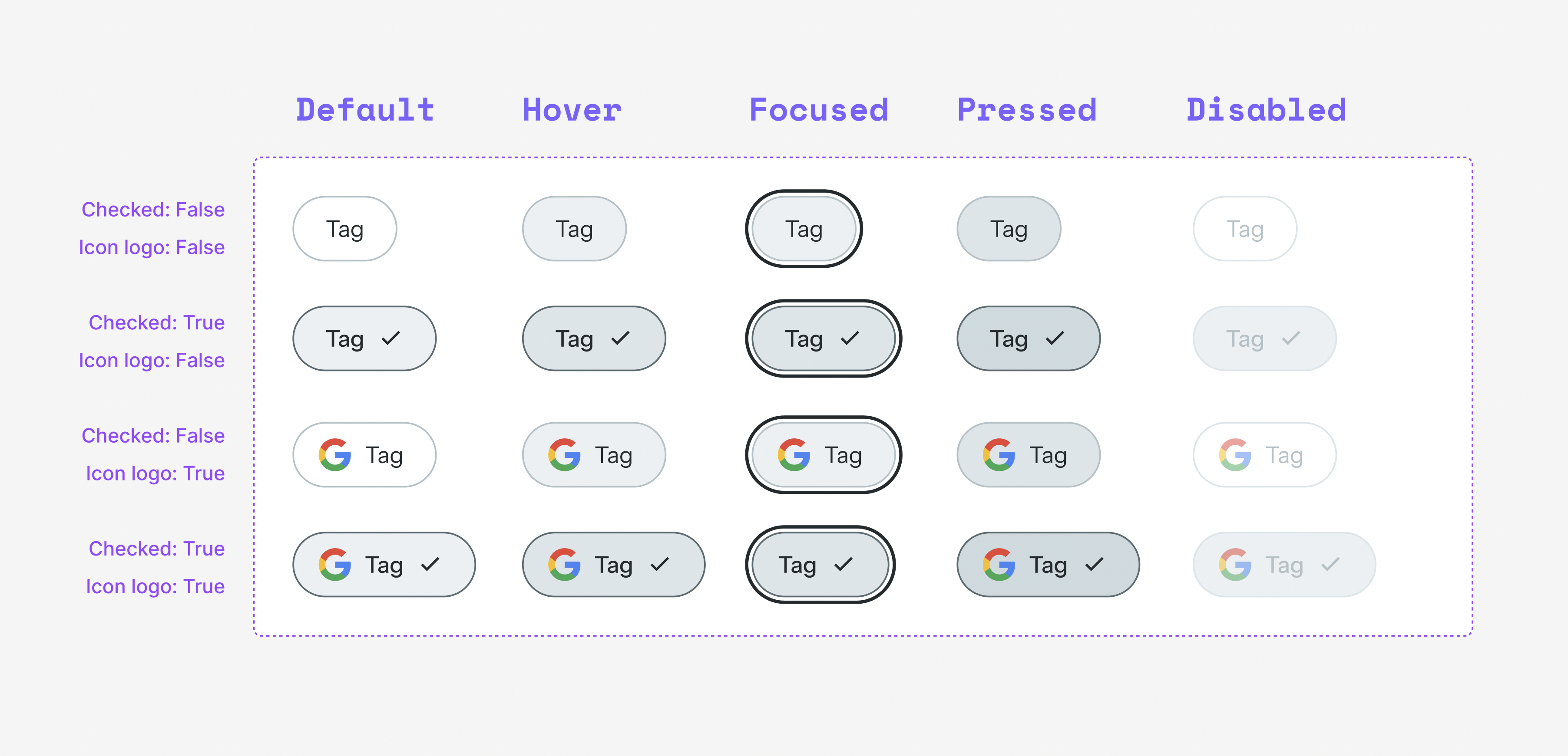
After

Fixing accessibility gaps

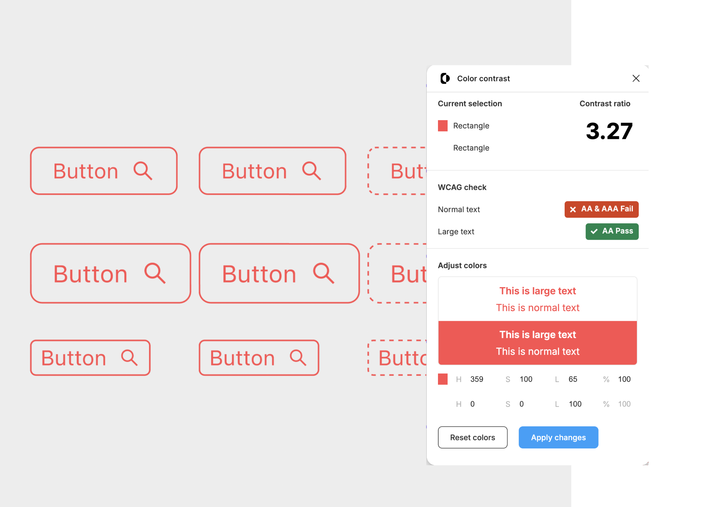
Ant Design had several accessibility gaps (WCAG 2.2) out of the box mainly with colour contrast, I audited it manually and by providing screens to AI agents.
Designing the AI experience

I defined a repeatable pattern for AI-assisted creative generation with three steps:

  • guide (check pre-filled information or result),
  • generate (create the result)
  • and process (show progress).
  1. Guide

Auto-filled – review before continuing

  1. Generate

Competitor

Input

Generate

  1. Process

Input Label

Generating...

Documentation as System UX

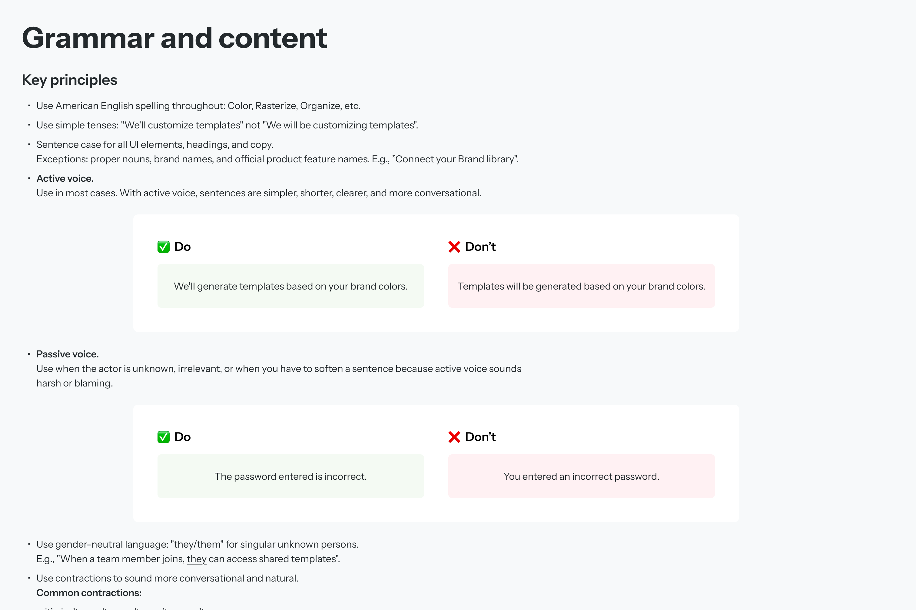
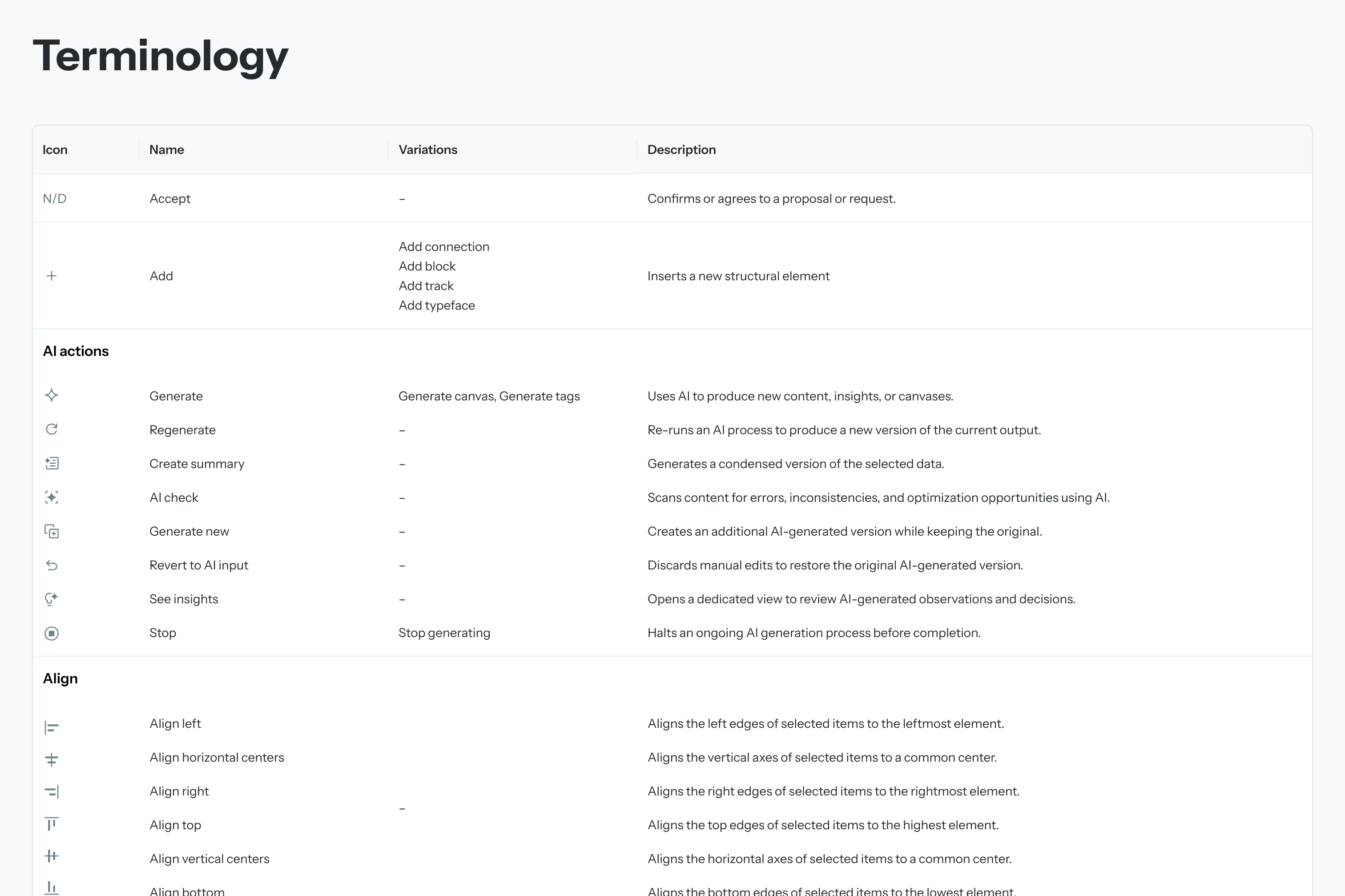
I wrote guidelines for tone of voice, common button names, components usage and page layouts, which stopped inconsistencies early in each project.
Handing over to developers

Result and impact

Public MVP delivered on schedule for Cannes Lions, directly supporting the closure of multiple multi-million-dollar deals. This was made possible by adopting Ant Design as the platform foundation, cutting six-plus months of build time.

Accelerated time-to-market: Adopting the framework saved an estimated 6+ months of build time compared to a proposed custom build.

Product Scalability: We successfully launched multiple complex sub-apps under a single, unified design language.

What I'd do differently

Avoid over-customising core components: I'd leave Ant Design's core components alone. Heavy custom changes became hard to maintain, so I'd now keep to a smaller set of changes.

File structure: Initially, we separated files by feature pods and kept ideation separate. We later merged explorations directly into primary feature files to improve cross-functional visibility.

Scaling Ecosystem Efficiency: Launching an AI platform on time with Ant Design

Role: Senior Product Designer | Team: 3 designers | Platform: Web | Client: AdTech Startup (2024–2026)

Web

Situation

An AdTech start-up was building an AI-powered marketing platform with several complex apps. It had just shifted its focus from small businesses to large companies, and a public launch at Cannes Lions was approaching.

Task

As Senior Product Designer in a team of three, I had to give the apps one consistent look and feel without slowing the engineers down.

Action

Building a system from scratch would have cost us time we didn't have. So we chose Ant Design, which matched the engineers' tools, and made it feel like our own product.

Building a timeline

  1. Prioritising what to change. Not every component needed attention, so I went through Ant Design's library and sorted components into four groups: use as they are, light customisation, rework or rebuild and new components. I prioritised by how often a component appears in the product and how much it affects the user's journey. This kept the effort on what mattered most and left the rest alone.
  2. Planning the team's work. I split the work between the three designers, so each person owned a clear area and we weren't duplicating effort.
  3. Timeline. I created a timeline that worked backwards from the Cannes Lions date, so we knew what had to be ready, and when, for developers to build it.

Token-Driven Architecture

Adopting Ant Design's token architecture made early brand iterations fast: colour updates resolved through a single primitive change rather than manual overrides across dozens of components.

The upfront cost was a full-day mapping session to trace how each primitive token cascaded into the semantic layer and into individual components. That foundation meant every subsequent change was made once, correctly.

#242A2D

Value

colours-base-10

Primitive token

colour-PrimaryText

Semantic token (Purpose)

button-colour-PrimaryColour

Component token

Handling overrides sensibly

Some components needed heavy customising, such as custom checkable tags and certain button styles, and this created long chains of custom code that were hard to maintain.

I went back, labelled each custom setting, added a short description and separated them out, so the next person could understand and change them.

Before

After

Fixing accessibility gaps

Ant Design had several accessibility gaps (WCAG 2.2) out of the box mainly with colour contrast, I audited it manually and by providing screens to AI agents.

Designing the AI experience

I defined a repeatable pattern for AI-assisted creative generation with three steps:

  • guide (check pre-filled information or result),
  • generate (create the result)
  • and process (show progress).
  1. Guide

Auto-filled – review before continuing

  1. Generate

Competitor

Input

Generate

  1. Process

Input Label

Generating...

Documentation as System UX

I wrote guidelines for tone of voice, common button names, components usage and page layouts, which stopped inconsistencies early in each project.
Handing over to developers
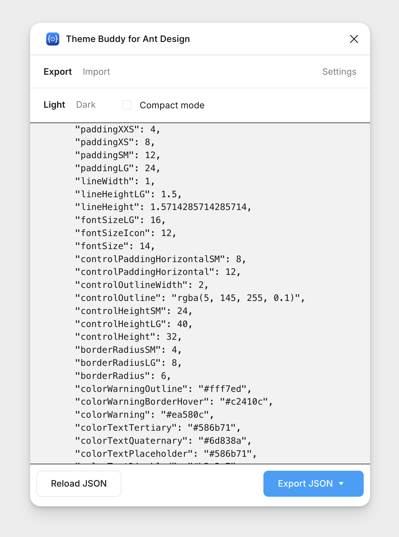
Before Figma released its own way to export design variables, I used Ant's design plugin to pass updates to developers as a JSON file, so design changes reached the code without manual copying.

Result and impact

Public MVP delivered on schedule for Cannes Lions, directly supporting the closure of multiple multi-million-dollar deals. This was made possible by adopting Ant Design as the platform foundation, cutting six-plus months of build time.

Accelerated time-to-market: Adopting the framework saved an estimated 6+ months of build time compared to a proposed custom build.

Product Scalability: We successfully launched multiple complex sub-apps under a single, unified design language.

What I'd do differently

Avoid over-customising core components: I'd leave Ant Design's core components alone. Heavy custom changes became hard to maintain, so I'd now keep to a smaller set of changes.

File structure: Initially, we separated files by feature pods and kept ideation separate. We later merged explorations directly into primary feature files to improve cross-functional visibility.